A bit of history
I joined Shoflo in May 2015 as the company's first design hire. My first project was spearheading a complete redesign of the app from it's basic MVP form into something that could accommodate product growth over the coming years.
In the time since, my responsibilities have expanded to include ownership of manual QA of features and bugs from the local environment through to full release. Additionally, in December 2015, I took on the role of providing live customer support through Intercom, eventually serving over 2,000 customer support requests.
Products and initiatives launched include: iPhone & iPad app, a PDF export wizard, design system, accessibility focus, email templates, illustrations, a teleprompter, and many more small knick knacks and features.
Streamlining Shoflo in 2019
In 2019, we established a goal of redesigning Shoflo. By this point, we had been running on roughly the same UI for over three years and had learned a great deal about how our increasingly varied user base was using the app. As our user base grew and we expanded industries, we steadily realized some inherent challenges with our information hierarchy and overall navigation.
Thusly, the project that would come to be known as "Prometheus" was born. The goal was to make Shoflo faster and easier to use.
Addressing legacy navigation issues
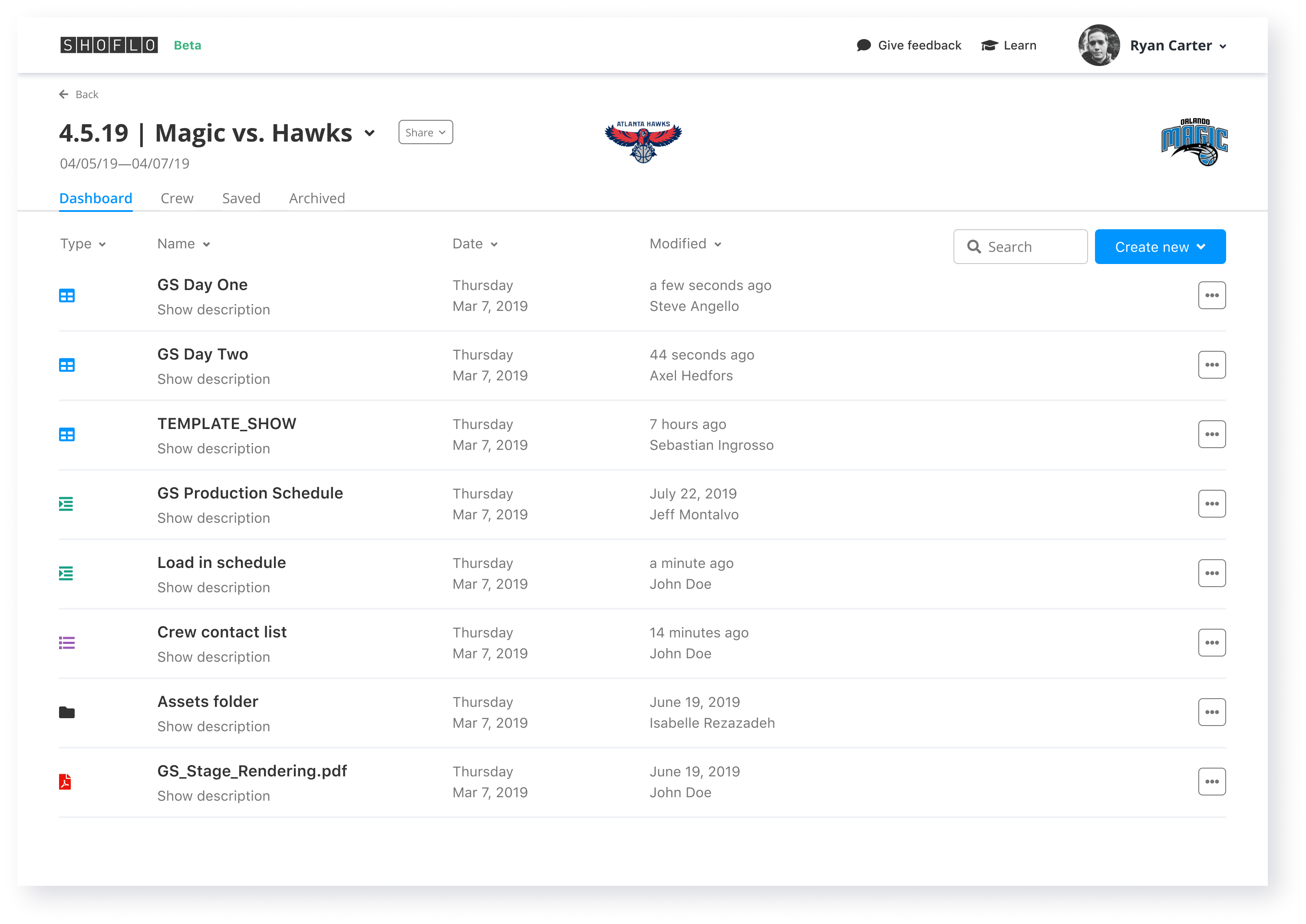
A challenge our users had with our legacy system was the number of clicks it took to get to where they wanted to go. For example, on first load, it took four clicks to get in to one our core products--Global Elements. Global Elements was buried in a subnav tab on their team dashboard behind an option in the side nav.
To fix this, we removed the side nav altogether, and defaulted users who were Team Admins to land on the team dashboard when the app loaded. This elevated the visibility of Global Elements to our users as a product, and made it only two clicks to get to instead of four.
Pioneering prototyping
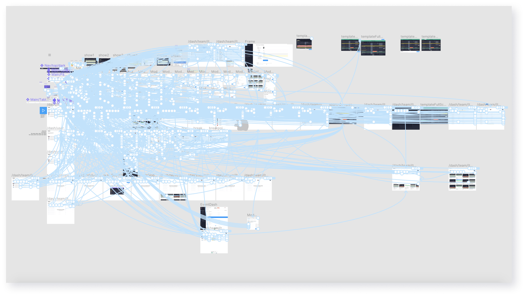
While prototyping wasn't anything new to Shoflo (we had been prototyping previous projects for quite a while), with the new design we wanted to be able to present in-depth prototypes during user testing sessions. Figma's powerful prototyping features, combined with components, made prototyping out the full flow easy and seamless. We presented this prototype during user testing sessions and the detail helped to uncover some incorrect early assumptions.
Finally, an illustration

Every big project at Shoflo gets a codename from a mythological creature or person. We dubbed this one "Prometheus", after the Greek god who gave fire to humanity. This was an illustration that we had printed on posters to hang in the office and use in promotional material.
Early concepts
The "widgets" approach
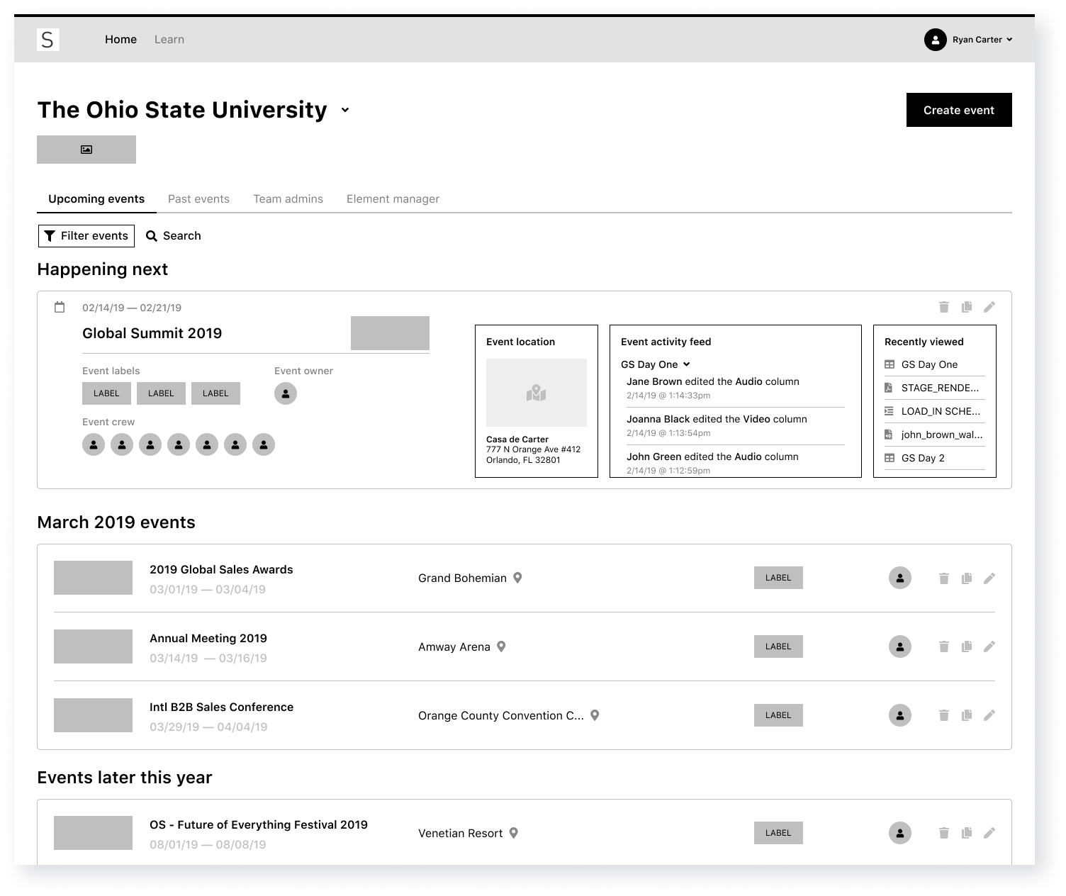
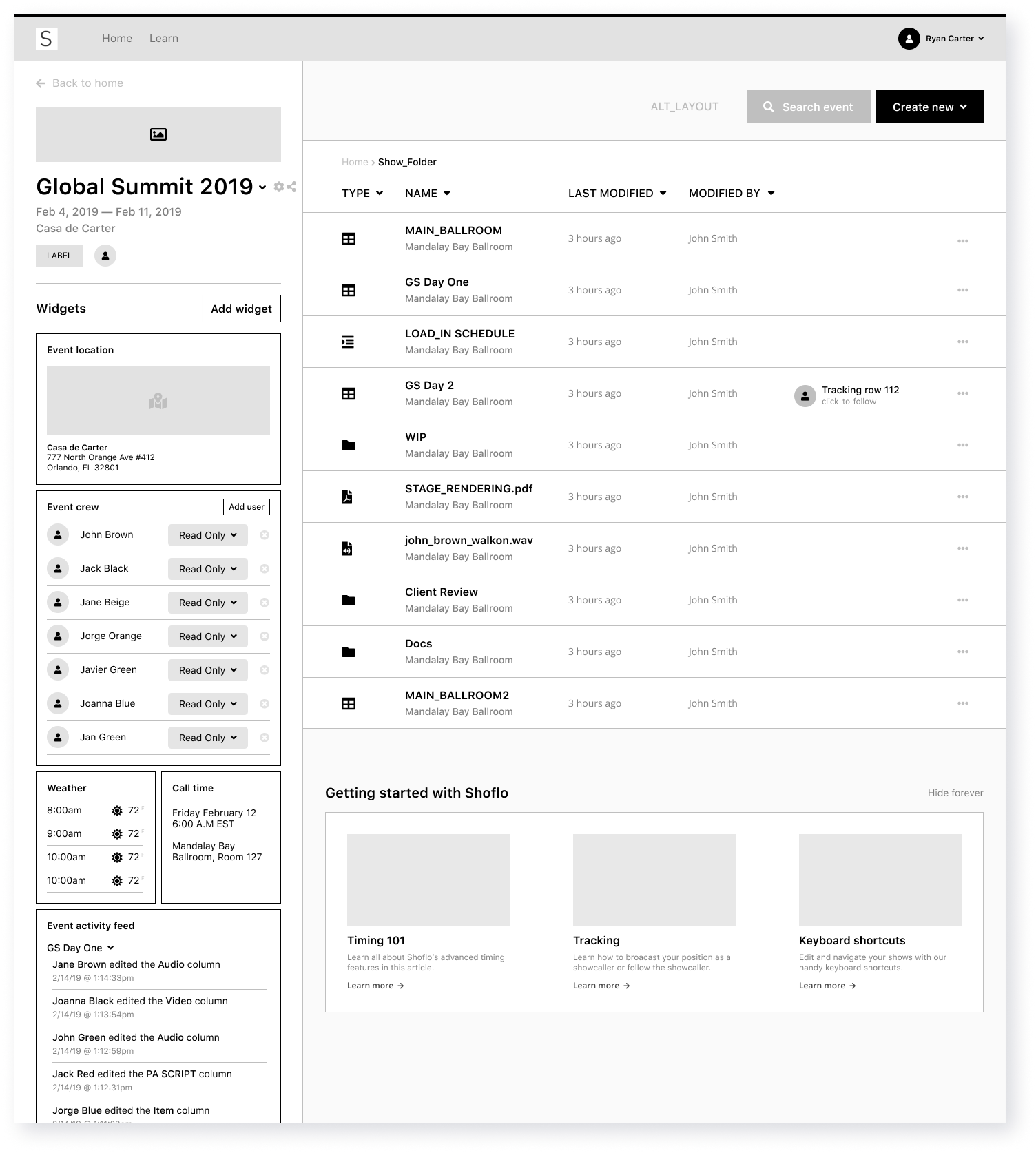
We explored the concept of adding a type of widget system, which could display info such as local event weather, activity, food booking, travel info, and more. While this idea was exciting and received positive feedback internally, in user testing sessions, feedback was lukewarm as our customers spent most of their time in the cue sheet.
Pros and cons
Pros
Cons
Going mobile
In early 2017, we began work on the first ever mobile app for Shoflo on iOS devices (a majority of our users use Shoflo on an iOS device.) Bringing Shoflo on to the palm of your hand proved a challenging task and required different thinking than on the desktop.
For one, mobile inherently has two main challenges: 1) you have limited screen real estate and 2) you can't hover to reveal extra content (and the desktop app at the time had lots of hover based interactions.) Secondly, Shoflo at its core is a horizontal, table based layout which makes displaying content in portrait mode rather tricky. Nonetheless, we launched an app after nine months of work and then again in 2019 set out to make it even better.
Fixing problems
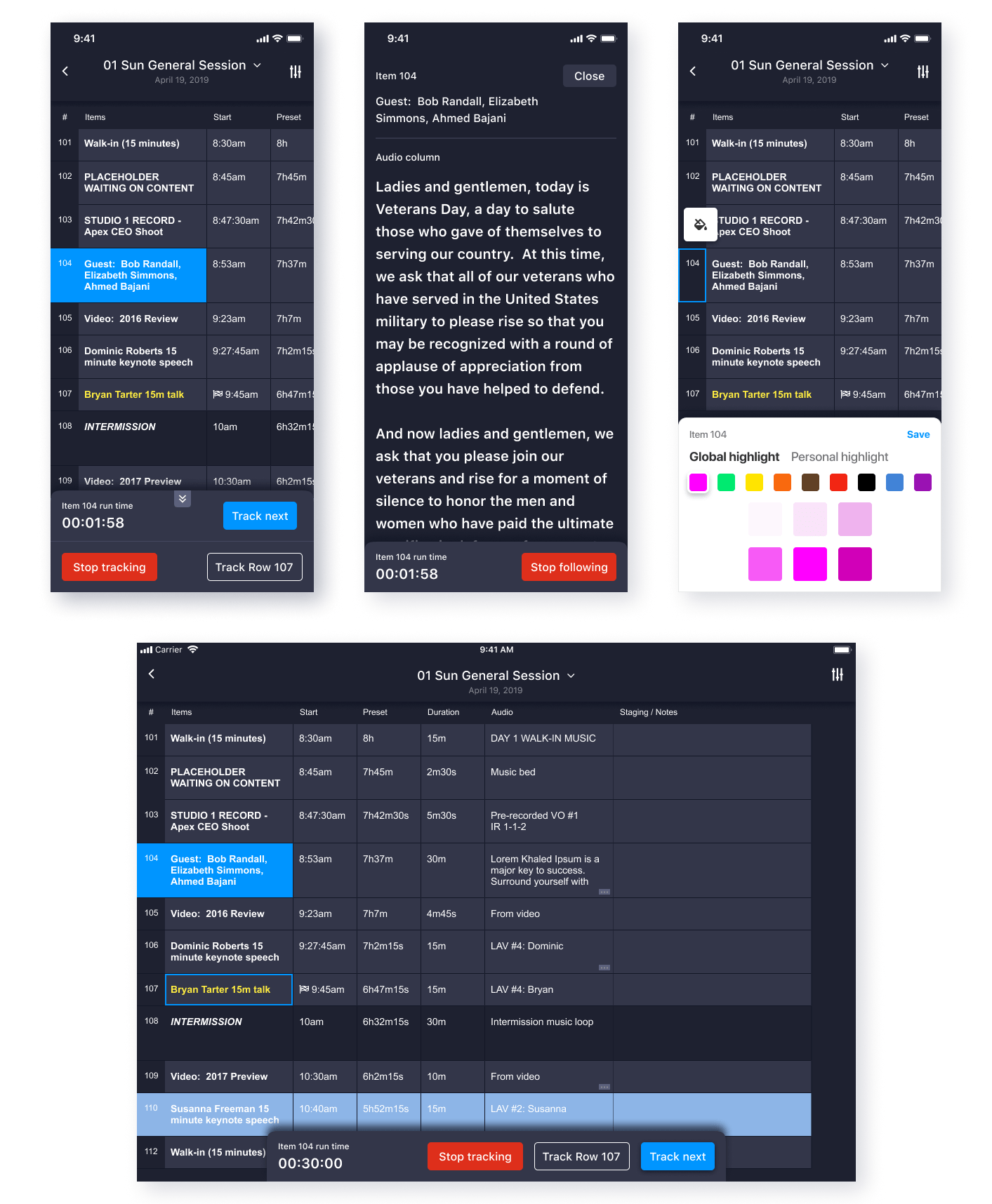
The problem
After the initial launch, we spent time fixing the usual bugs and crashes. Over the next few months we listened to and gathered feedback on the app from our customers. It was too difficult to find out where the Showcaller was broadcasting.
In the screen here, when a Showcaller started broadcasting, we had no affordance to indicate that. To follow along, you needed to tap the icon in the upper right, then on the Showcaller's name through an action sheet.
The 2019 solution
To make this crucial piece of Shoflo functionality easier to discover, we implemented a bottom "pane" that auto appears whenever a Showcaller starts broadcasting a row. With just one tap, a user can choose to follow that Showcaller, or the pane will auto-disappear after a short while.
Once engaged, the pane updates to display the item run time of that element, and an easy to tap "Stop following" button that will disengage Showcaller tracking.
Finally, an illustration

Other projects
PDF Export Wizard
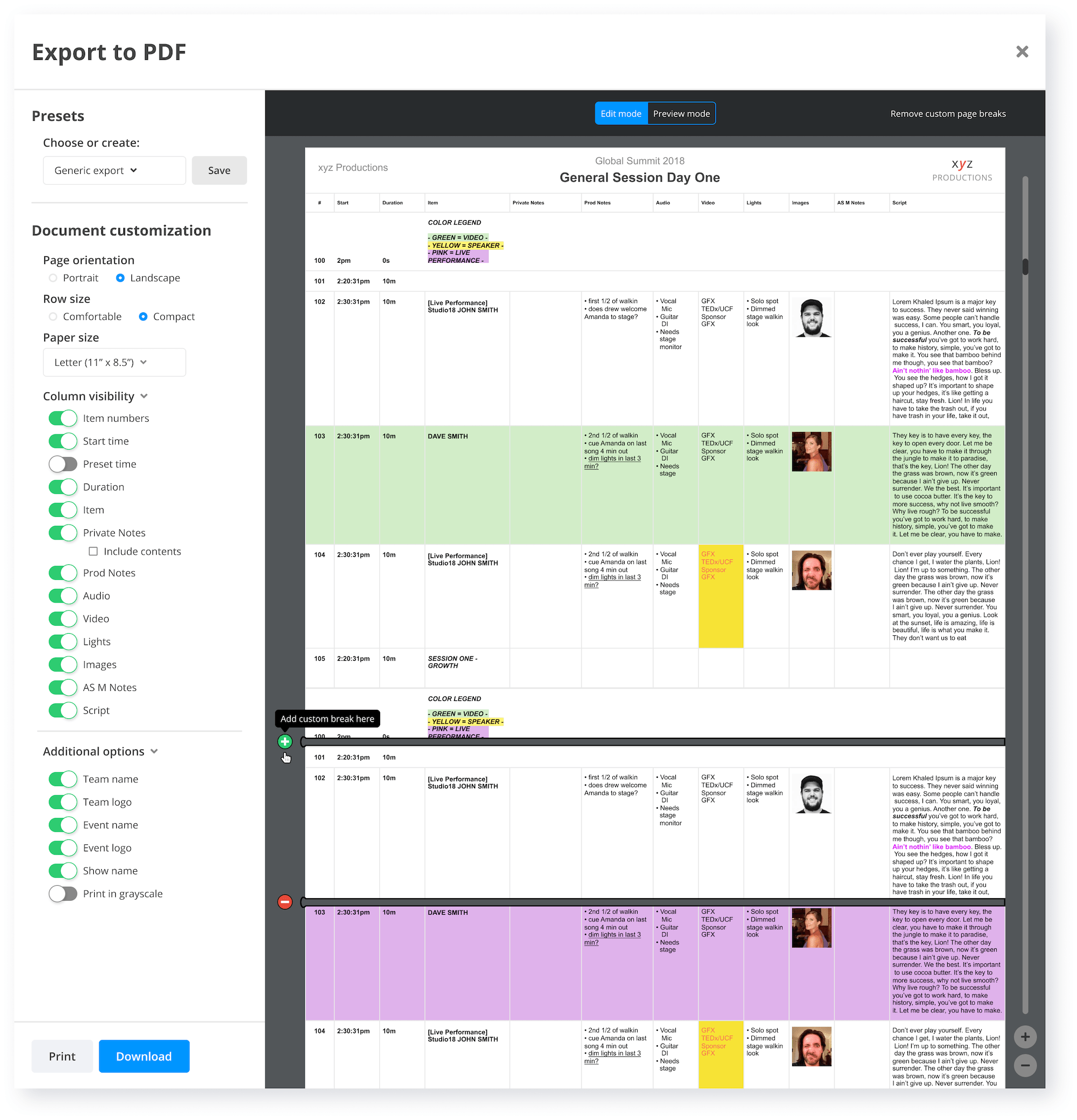
A popular piece of functionality in Shoflo is the ability to export your content to a PDF file. For years, customers requested the ability to have fine-tuned control over their exports through hiding/showing columns, paper sizes, and controlling where page breaks go.
After some iterations, we launched a new PDF export in early 2019 through a full screen, interactive modal.
Internet Explorer unsupported splash
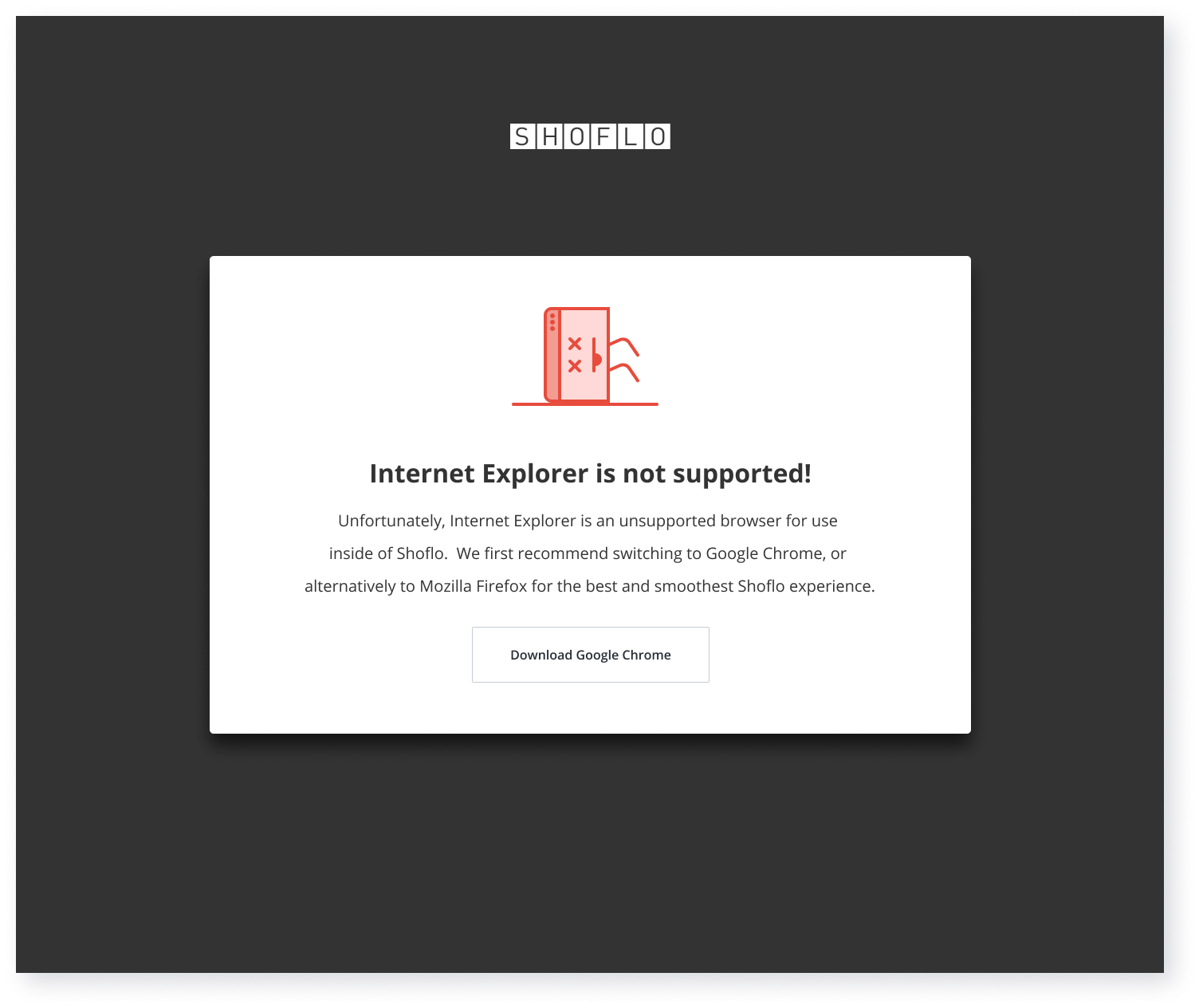
Some of our core dependancies are unsupported by Internet Explorer. To combat this, we gate all Internet Explorer users at signup. This is the screen an Internet Explorer user will see with a custom illustration, explainer text, and a button to download Chrome if they don't already have it.