The problem
Prior to implementation of Polymer, Shoflo had no real set of unified visual identity. As the sole designer, the blame admittedly fell solely on me. Rather than sticking to a set of guidelines, many product design decisions were made "in the moment." Over four years, these small inconsistencies had created numerous problems, such as:
10+ modal patterns. Some had buttons on the right, some on the left, some on the left and right
20+ shades of gray
2 different font families
8 different button sizes
Increased development time to make custom components
Failing WCAG accessibility guidelines
Increased effort for customer support to document different patterns
In early 2019, I set a goal to fix these problems and implement our first design system to support an upcoming product redesign. Armed with Figma and the internet, over the next several months I designed and helped to implement Polymer.
I personally set a few core tenets of Polymer:
Above all else, it had to meet WCAG AA guidelines for accessibility.
It had to simultaneously be flexible and rigid.
It had to be predominantly on an 8px grid (with exceptions made for 4px.)
Every component has documentation for developers.
My role
As the only designer at Shoflo, my role on Polymer was pretty much everything:
Setting up the Figma project and component naming structure
Keeping up to date with Figma and making sure components used the latest Figma features
Writing documentation for components
Helping implement with the development team
Fixing "bugs" with components (such as improper constraints, instance swapping not preserving overrides, auto layout issues and so on)
Components
Below is a list of components such as buttons, inputs, typography, and colors. Note: some of these components are being currently updated in Polymer as we make changes to the visual identity.
Name and logo
All good design systems need a name and a logo. I settled on "Polymer" since a polymer is defined as "A substance or material consisting of very large molecules, or macromolecules, composed of many repeating subunits." As such, "Polymer" seemed fitting for a design system and it has the added bonus of starting with a "P", which all of our internal product codenames start with! The icon is a seven sided heptahedron; one side for each letter in polymer.
Accessibility and Polymer
Prior to Polymer, accessibility unfortunately was not a high priority at Shoflo. Partly because we had no design system, but mostly because it was an area I had little experience in. Starting in 2019, I started to learn more about accessibility and it quickly became a core tenet to my design and a fundamental belief that products should be useable to everyone.
But since we had been running for over four years with no design system, it was a tough task for our small product team to spend the time to make the existing product accessible through focused development across a non-consistent design. After much debate, we agreed that going forward we would make the new apps accessible from the core through a design system.
P.S. I'm currently working on an accessibility side project, check it out!
Core beliefs
Design for everyone
"Everyone" is a broad group of people, and Shoflo's users span the full spectrum of human diversity. "Everyone" includes a veteran event director, a 21 year old VFX artist, people across time zones, different cultures, and quite literally anyone in the public who accesses a Shoflo event. By designing an accessible product from the ground up, you make it useable for everyone.
Use semantic HTML
We can eliminate a lot of the extra work of making features accessible by taking advantage of what browsers already do for us. This meant designing and building core components using semantic HTML as much as possible--things like <buttons> instead of button-styled-spans.
Fail inaccessible builds
We set a goal of not letting any inaccessible features reach production. After some research, I suggested and we implemented CI checks that will fail a build by a developer if it detects any accessibility violations. We ended up using cypress-axe.
Sample accessibility guidelines
This is obviously not everything, but it is a glance in to some of the accessibility guidelines built in to Polymer.
Colors

In Figma, all colors in a palette are shown with their contrast ratio. Every 500 level color has a contrast ratio of at least 4.5:1 with white text (this combo is used in buttons).
All colors above 500 with white text are at least 4.5:1, and all colors below 500 are at least 4.5:1 when the 1000 level color is on top.
Lastly, the color system is setup to ensure that all 700 level colors are accessible when placed over a 000 level background (this combo is used in alerts.)
Forms & Inputs
Form & Input rules:
Every input is labelled in some capacity. Ideally by a <label>, but in scenarios where a label won't fit, we use an aria-label instead (for instance, a search input).
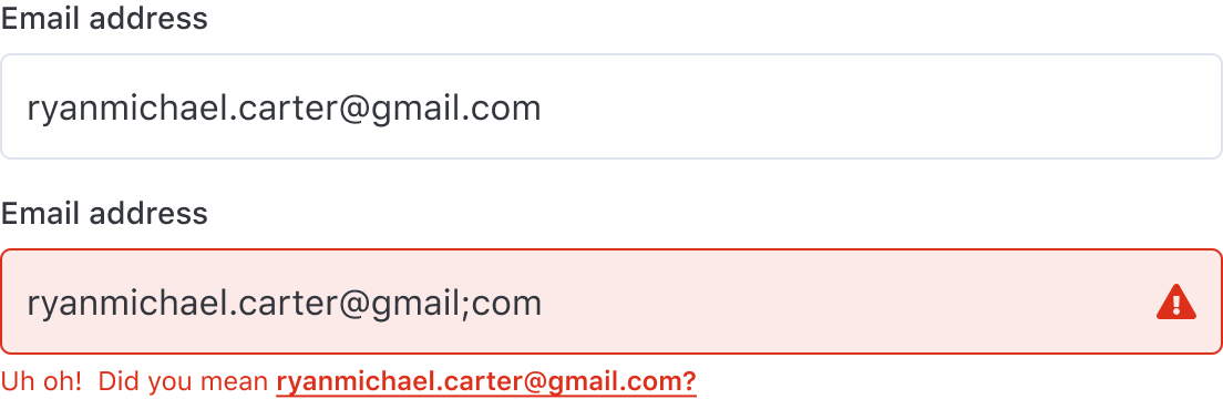
Errors to an input are validated via three visual indicators:
1. A red border and subtle red-tinted input background (for quick visual identification)
2. A red triangle-exclamation icon right aligned in the input
3. Clear and concise text explaining what the error is and how to fix itErrors also require a unique ID, so that the error can be tied to the failing input being aria-describedby
Offer the user the ability to one-click fix errors if available
Buttons
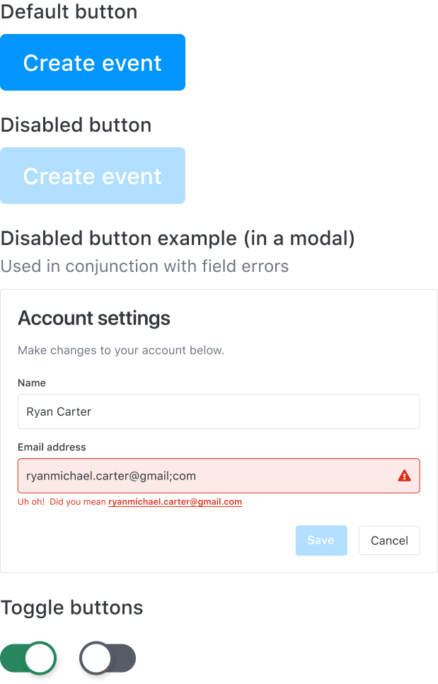
Button rules:
Always use a native HTML5 <button> element
Add a disabled prop to set the state of the button to disabled. This visually sets the appearance of the button to its disabled style and communicates it to screen readers
Toggle buttons should always have an aria-pressed value of true or false
Don't use buttons to navigate to different parts of the app, use links instead
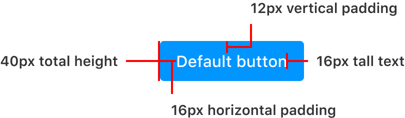
Grid system
Polymer was designed on an 8pt grid to create vertical rhythm. This means that all text elements, buttons, padding, margin, and inputs would be in increments of 8 (or 4 in the rare case 8 was too much, but it would still ultimately fall in increments of 8.)
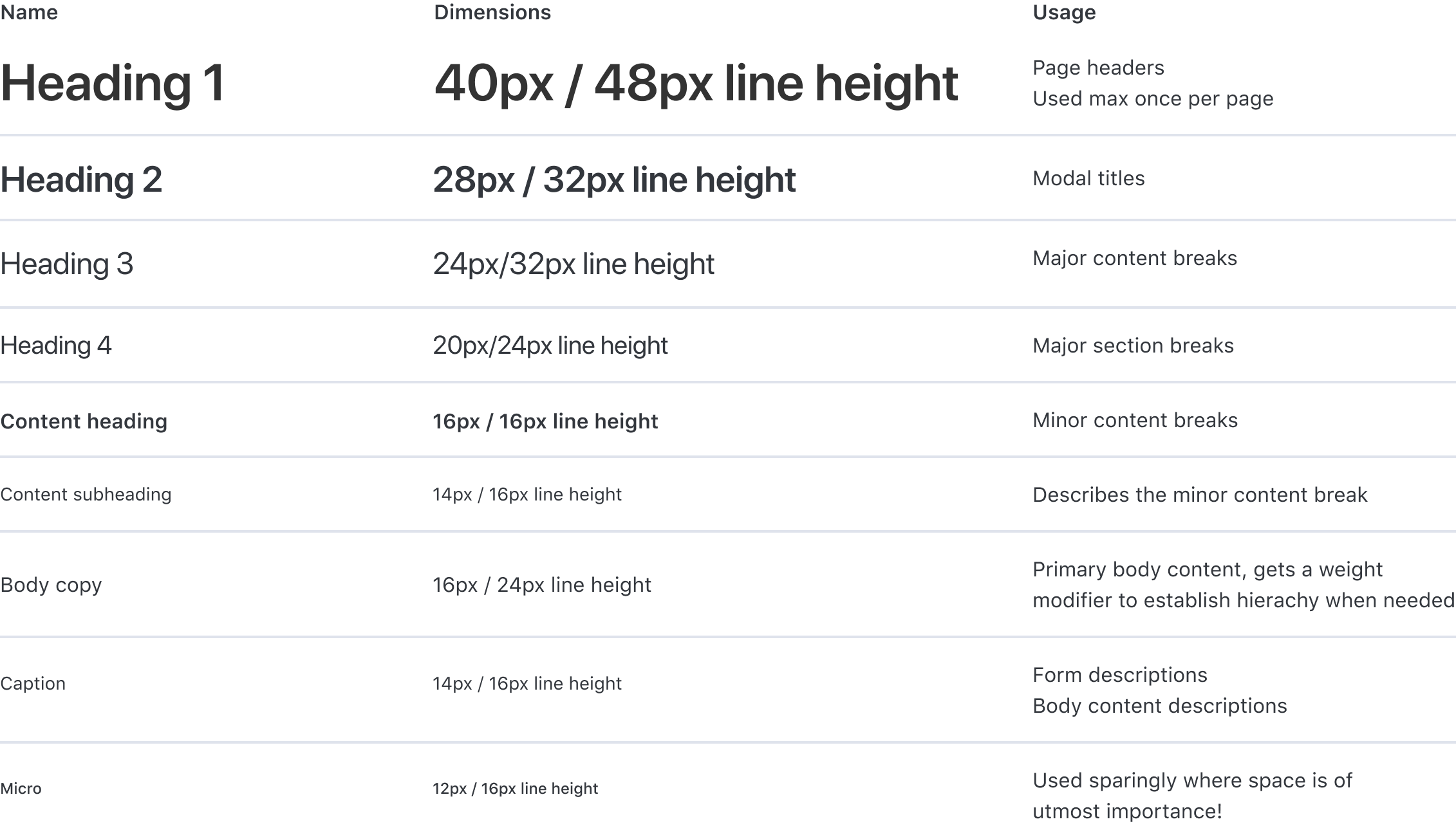
Typography
After running on Open Sans for four years, we switched to using system defaults such as SF Pro Text & SF Pro Display for improved performance.
Buttons
Polymer's buttons were the first components to be updated to use Figma's new Variants functionality.

GIF showcasing quick swapping between Variant properties in Figma

Modals
We make good use of modals at Shoflo, with a lot of extra actions being completed inside of a modal. Before Polymer, we had at least three modals with different header styles and button placements. After Polymer, there is one modal style to rule them all.

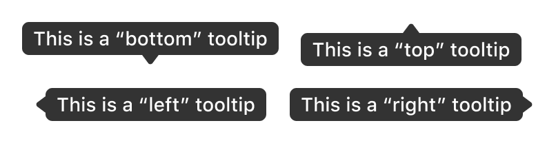
Tooltips
Tooltips offer a great way to provide extra yet concise information to UI elements. To make them accessible, tooltips can be displayed whenever a user hovers or gives keyboard focus to a tooltip's corresponding UI element.

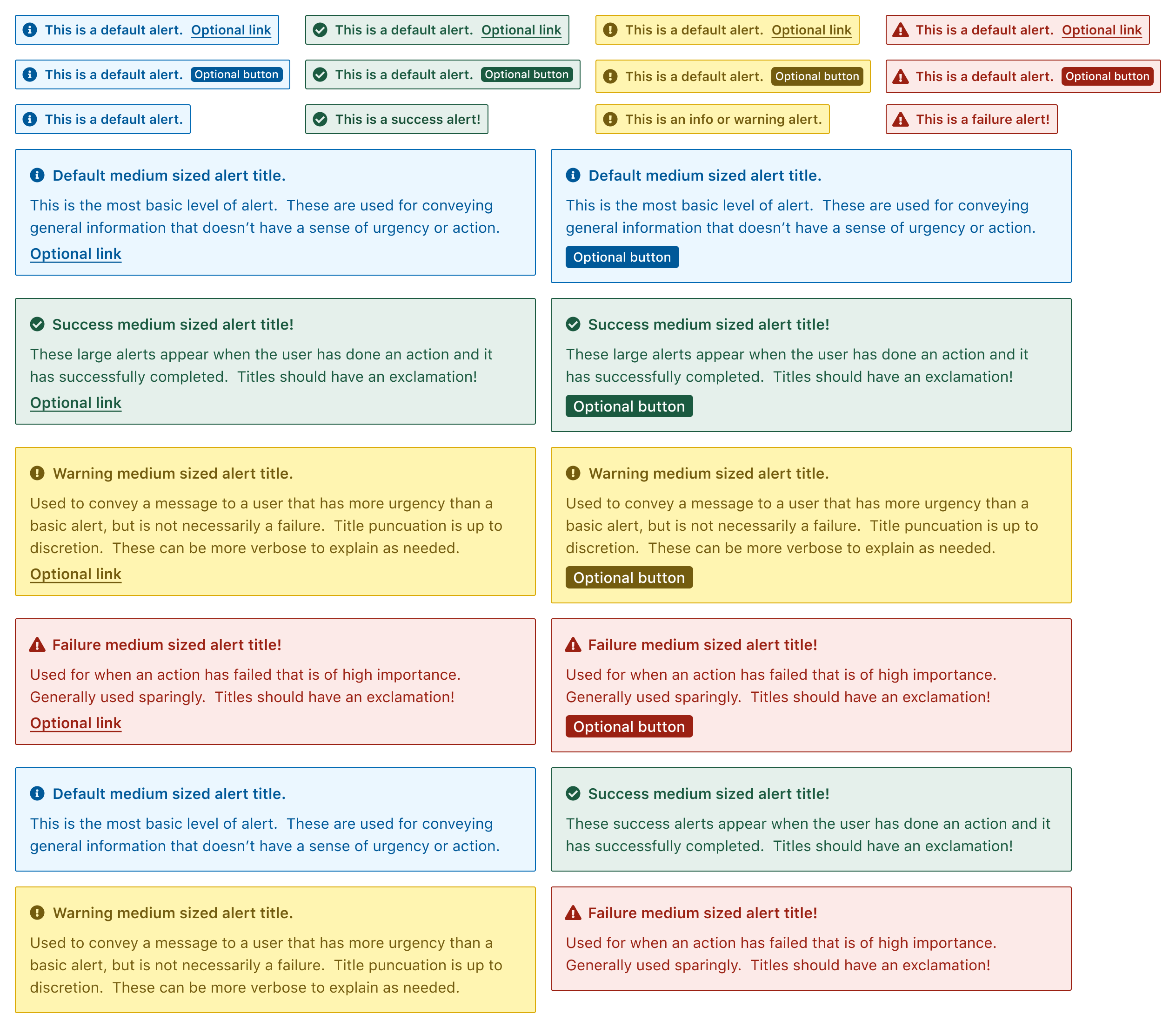
Alerts
Alerts provide an...alert as to the status of an action by the user, or a particular state the user is in. For example, to provide affirmation that an action the user took was successful, we throw a success alert at the top of the screen. Or, if there is a pressing need to notify the user of a change in the state of their account, we'll throw a medium-sized alert in a prominent area of their screen.
For accessibility, alerts should contain an aria-live="polite" attribute, so that screen readers will wait until existing content has been read until reading the contents of the alert.
Some alerts can contain an optional link that will route a user to relevant documentation related to their action. Alerts can also contain a button which, depending on the alert, will perform an action related to the alert. If a user's action failed, the button can re-attempt the action once more. Or, if the action was successful, we can throw a button to undo the action.
Polymer in full
What is shown above is just a small snippet of what is available in Shoflo's Figma design system. In total, the design system has 400+ named and organized components such as:
Avatars
Badges
Breadcrumbs
Casing, language, and grammar
Colors
Confirmations
Cursors
Dividers
Dropdowns
Forms & Inputs
Icons
Images & Logos
Labels
Lists
Mockups
Modals
Navigation
Pills
Screens
Toggles, Radios, and Checkboxes
Documentation
Design systems are only as good as their documentation. While Figma is great, there is a lot more to the components shown above than what can be conveyed in Figma. Documentation like code snippets, testing rules, and interactivity to showcase varying states are all currently being built in a dedicated site for the product team to use.
Our goal is to potentially showcase and open source this design system for anyone to use.