The problem
Prior to COVID-19, Shoflo's core business model was reliant on large amounts of people gathering in tight spaces to watch and experience live corporate, sporting, worship, and entertainment events. As COVID-19 spread and in-person gatherings were banned, we quickly realized we needed a way to bring those in-person events to the virtual world.
At the time, there weren't any real already-existing solutions that our customers could rely on. While products like Zoom, goToWebinar, Google Meet and so on offered virtual streaming solutions, they were more geared towards short meetings. Furthermore, our users required greater control over the experience than offered by those solutions. Directors wanted to control exactly when presenters would be added to a stream, and the ability to independently control a user's audio and video.
We set out in April of 2020 to rapidly design and build a solution we could begin testing with users. Over the course of the next year, this project would grow in to the most complex and comprehensive design I've ever undertaken. As the only designer, I was responsible for the entire look and feel of an always-in-progress and evolving product.
The challenges
Designing a new product from scratch with minimal use of our existing Polymer design system
Designing a product powerful enough for seasoned pros, but easy enough for anyone to use
Providing an accessible experience for a highly complex audio/video product
Designing one inch in front of developers
The responsibilities
As the only designer at Shoflo, my role on Studio was pretty much everything:
100% of design
Prototyping
Writing documentation and specs for developers
Project management
QA
The solution
More detail is provided below!
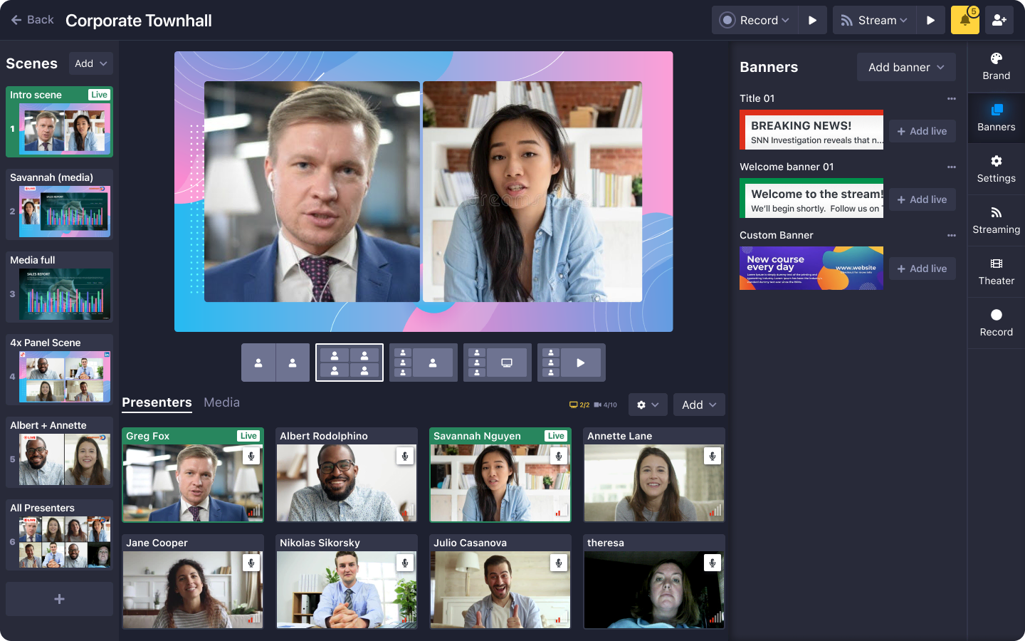
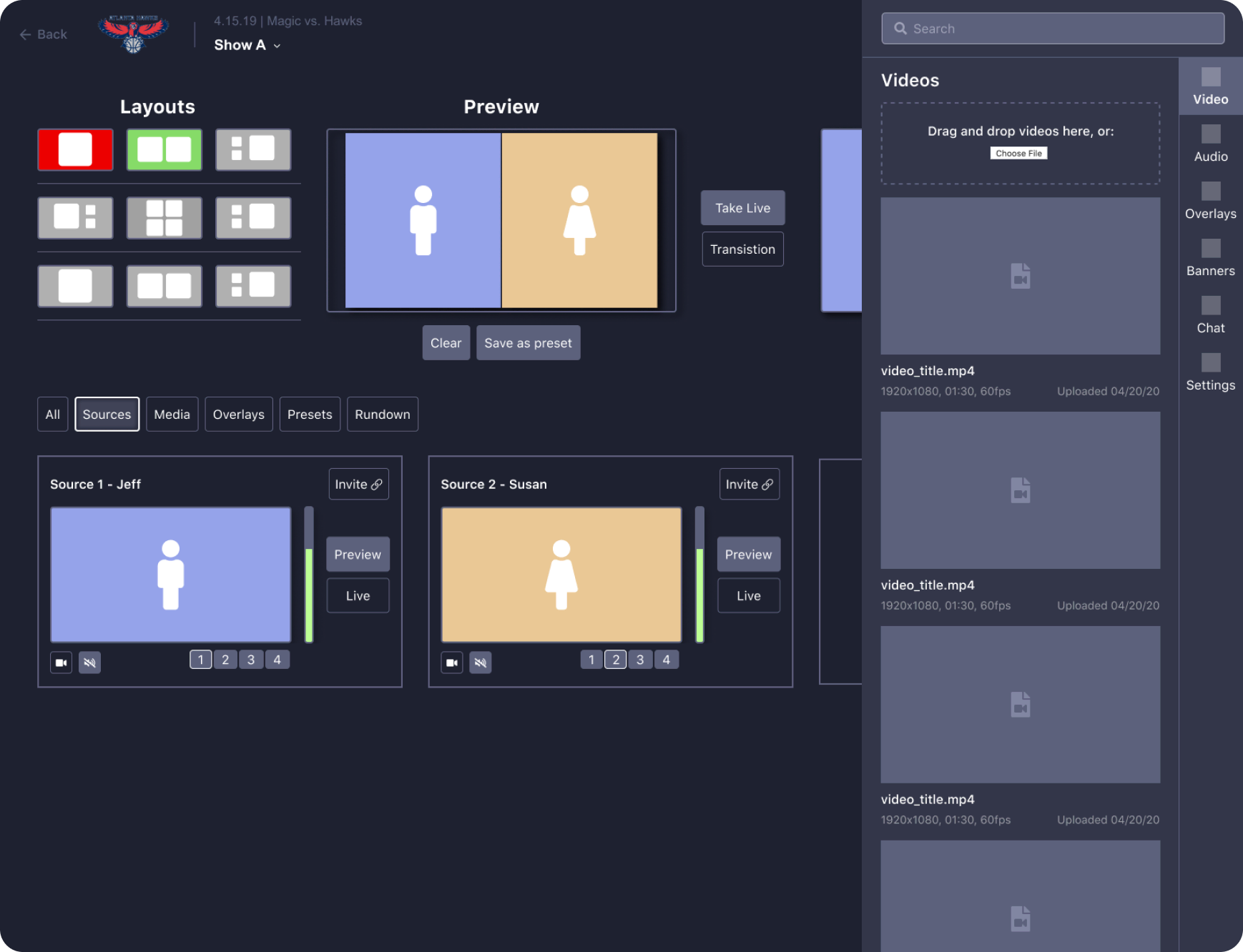
UI explained
While good UI shouldn't have to be explained, Studio is a complex product and is best experienced hands-on in the browser. This is just a loose guide to the major UI components seen in the above screenshot.
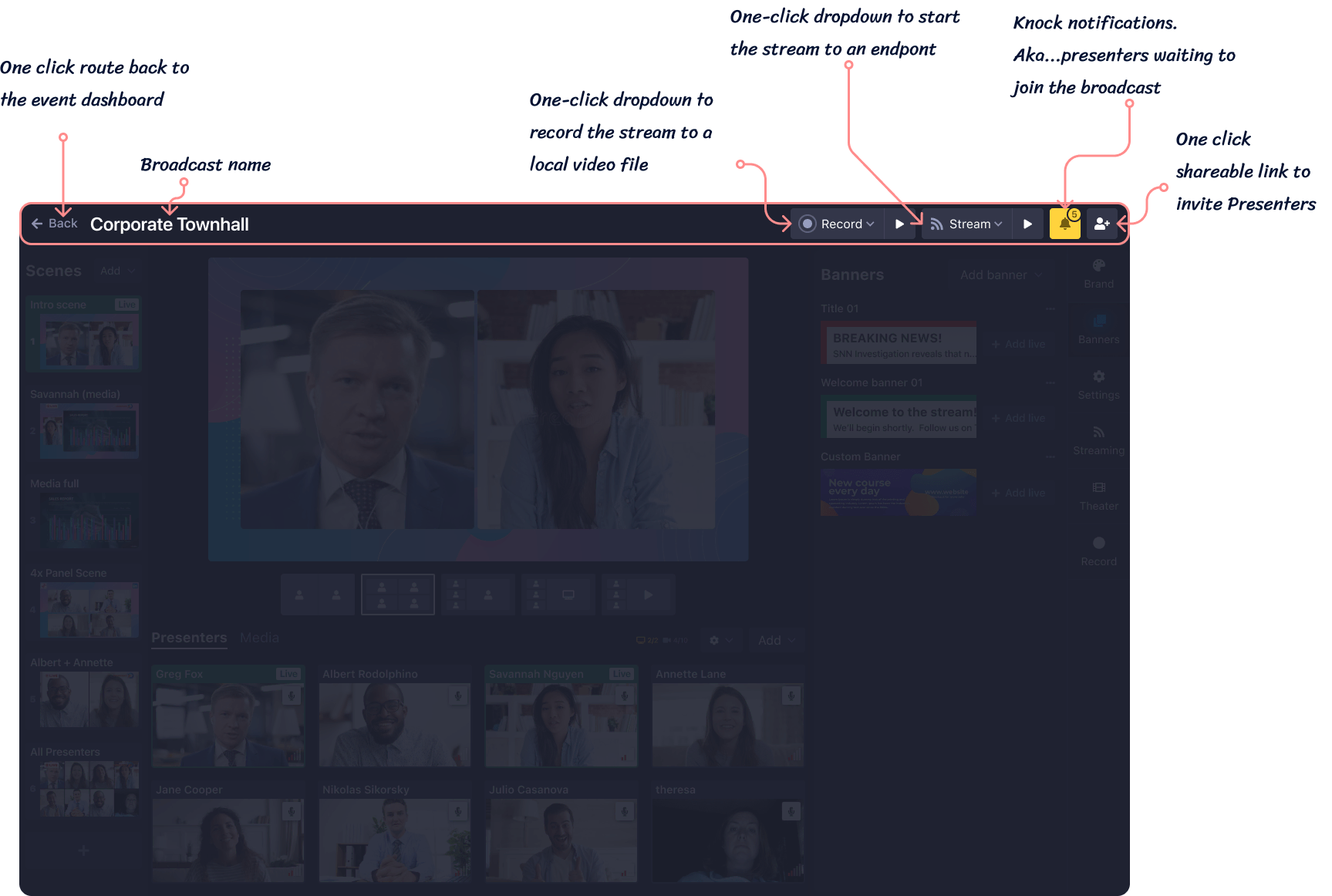
Studio header
The header is the top-most page element, and contains navigation, information, and actionable buttons.
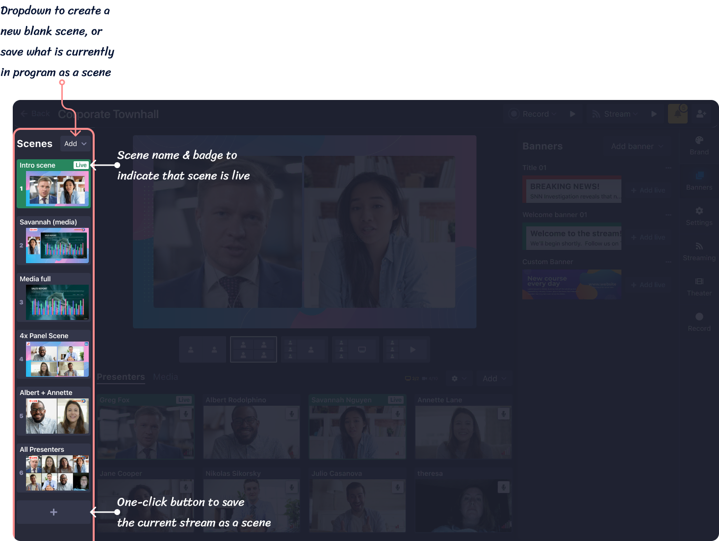
Scenes bar
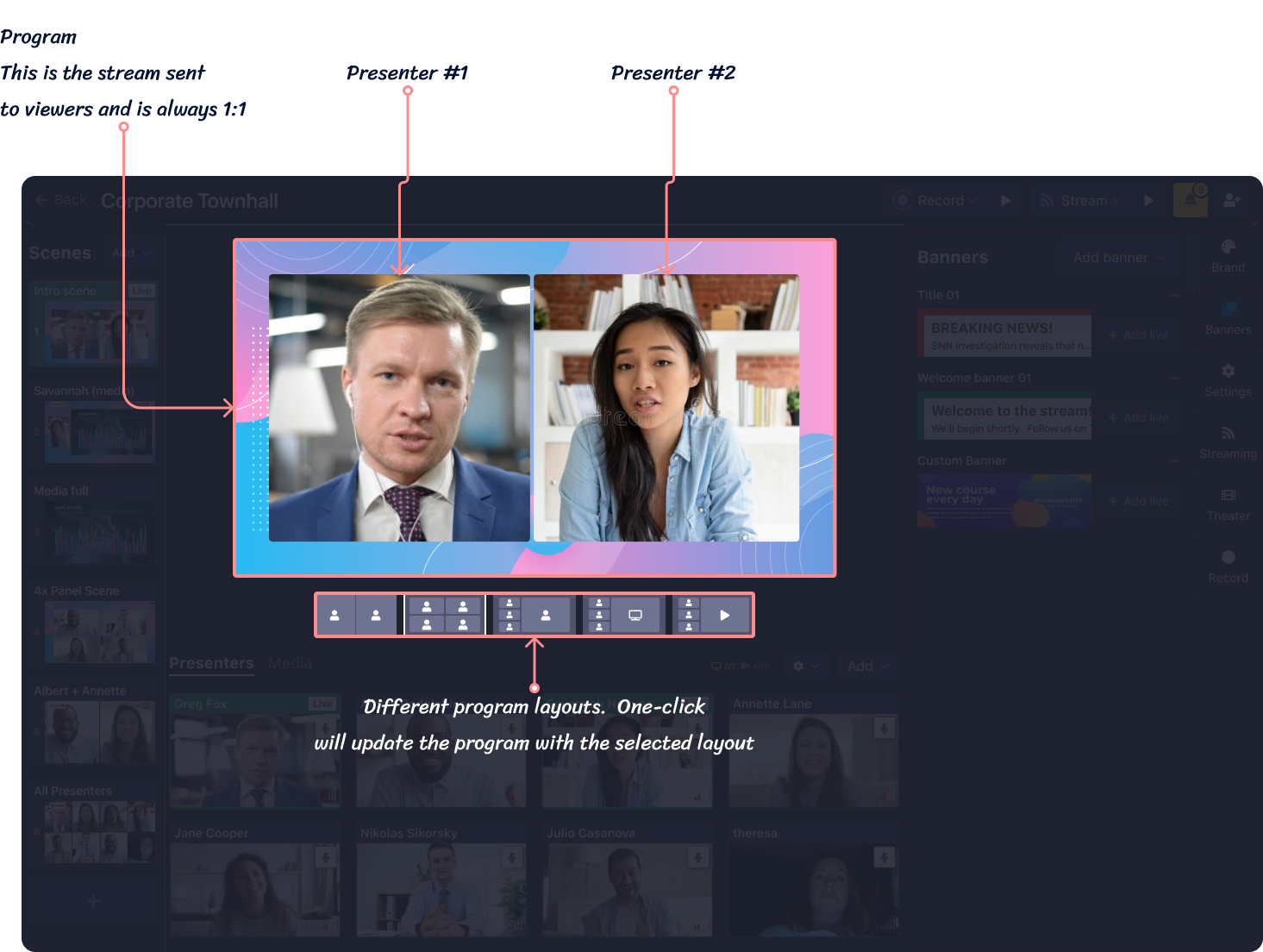
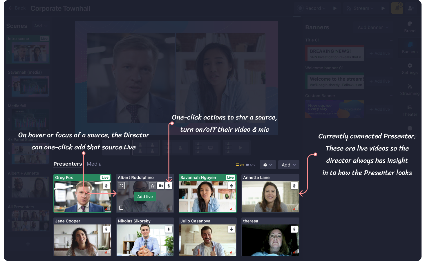
Scenes are layouts build & saved by a director containing a layout, presenters, and graphics. With one click, Directors can send that scene live and the stream will be instantly updated. This is different than live directing, where a director would need to one-by-one send presenters live and update graphics. This is not desirable because to an end viewer, assets would appear one by one which doesn't look professional. With scenes, it is a smooth transition.
"Program" aka "Broadcast" aka "Stream"
The most prominent piece of UI for the user is what we internally referred to as the "Program". Essentially, it represents the current stream that viewers are watching. Whatever is seen in the program is seen in the stream, so what the director sees here is what a viewer on Vimeo or Youtube would also see. It is also the view recorded when the user clicks the "Record" button.
This area is where presenters, videos, images, screen shares, banners, and overlays are positioned.
Presenters & Media
Anchored to the bottom of the Director's view is where presenters are housed, both actively connected and their placeholder sources. Split out in to another tab is Media, where Directors can upload videos, images, and audio.
Extra functions tabs
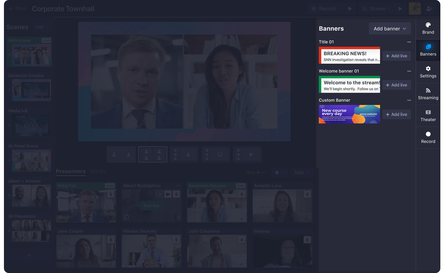
To house all of the extra functions that Studio offers, we implemented a vertical tab bar anchored to the right side of the screen that contains Brand (logo, colors), Banners (lower thirds), Settings (general broadcast settings), Streaming (to set up and fine tune endpoint streaming), Theater (settings for Theater, a place for the general public to watch a broadcast), and Record (view and download past recordings.)
Key constraints
Most content had to be designed around a 16:9 aspect ratio
- It needed to be complex enough for pros to use, but easy enough for anyone to use without needing a training session
- It had to be designed and built fast by a small, but growing team
- It was largely incompatible with our existing design system
- Shoflo didn't have have: Metric/data collecting, Dedicated user researchers, prototypers, data analyzers, content writers, documentation writers
Version .0001
Issues
Lots of clicks involved in navigating a source through preview and to live
- High amount of information present on the screen at once, including computer resources needed to render large amounts of video at once
- User testing revealed that “amateur” users didn’t fully grasp the concept of Preview
- Layout not conducive to responsive or smaller sized displays
Issues
Left to right layout didn’t leave a lot of room in the UI for other functions such as banners, settings, endpoints without being in a modal
- Side panel would cover what you see in Live
- Shifting content would cause layout issues
Presenter View
Presenter View is where Presenters and guest speakers join in to the broadcast. Here, Presenters initialized their camera, microphone, set their name, test their connection, and start a screen share. Presenters can switch tabs to view the Live broadcast, or see only the other presenters currently connected. Additionally, Screen 1 & Screen 2 tabs give Presenters to give any of the two active screen shares.
Presenters can also chat with each other, and the director.
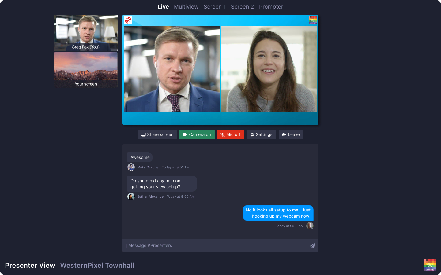
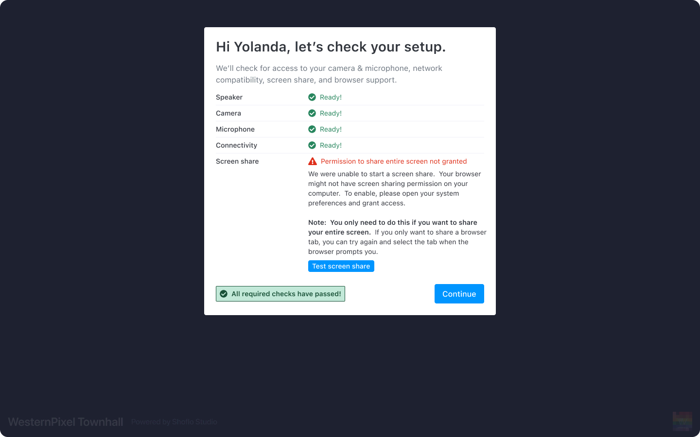
Readiness checker
To ensure Presenters can connect to the servers and the browser has access to camera/mic/and screen share, all presenters are required to go through a Readiness Checker before joining. If any part fails, we inform the user what went wrong and how to fix it.